A critique of the Linear website
Few companies have had as much impact on modern websites as Linear. In that sense, they have inherited Stripe’s crown.
This is not a coincidence, even if the Linear and Stripe websites don’t look the same. Both Stripe and Linear spend an unusual amount of time on design. Both Stripe and Linear have released several industry-influencing websites in a row. When Linear’s latest website was published, they held a question-and-answer session in a Figma file. They explained that the website design took four months.
This dedication to quality is reflected elsewhere in the company. They named December 2022 “polishing season”, and dedicated the month to quality-of-life improvements in their app. It should come as no surprise that their website sets visual design trends.
Both Linear and Stripe are products designed to appeal to developers. I don’t know if that’s coincidence, but it’s worth a mention.
And as with Stripe, the quality of the Linear website acts as a siren call for talent. Given that they intentionally keep the team small, it’s an enviable company to work for. I suspect many developers and designers would jump at the chance, even if they don’t use the product.
The era of dark mode
Linear’s most noticeable influence on modern website design is dark mode. And it’s a perfect match with the Linear’s identity.
Darkness is a good fit for Linear’s rebellious product: “ditch your crusty old issue tracker for the new hotness”.
Darkness suits developers practically, who stereotypically work through the night and don’t want to be blinded by light interfaces. In this way, Linear targets developers as customers even more than Stripe famously did.
It feels obvious in hindsight. It has unfortunately started a trend which many websites adopt even if it doesn’t suit their brand.
Visual consequences
Dark mode has practical visual design applications. It allows for lighting-style effects that are not easy or possible on a light mode website.
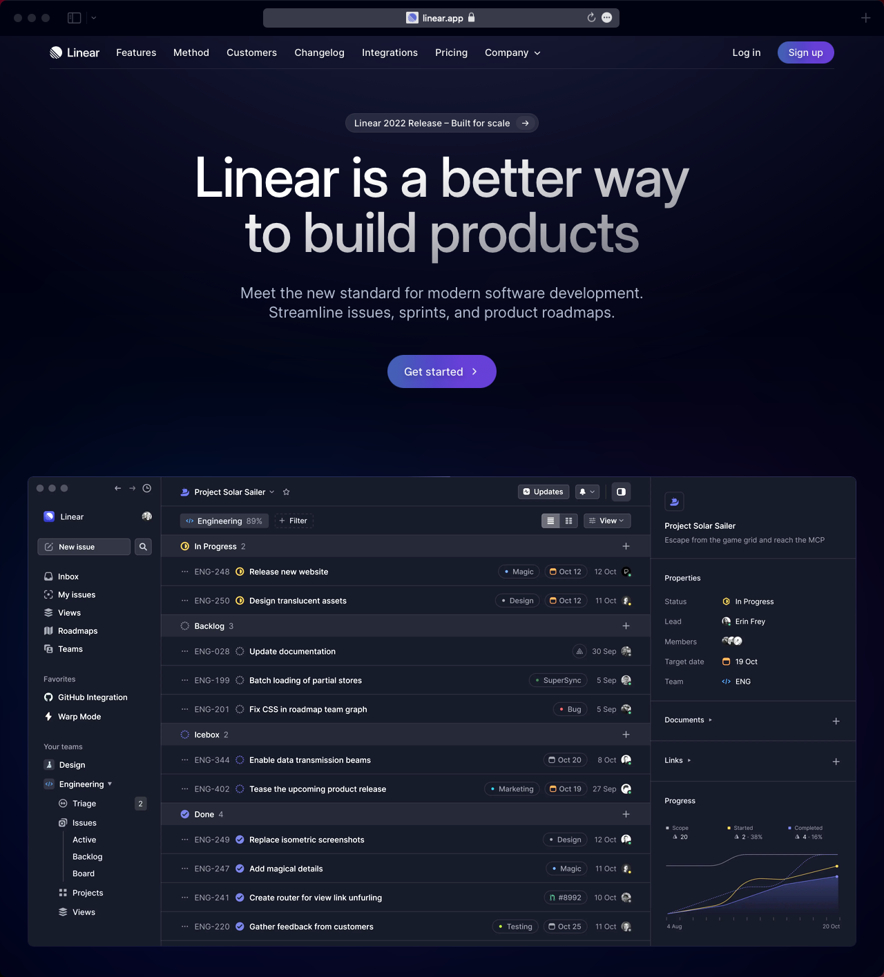
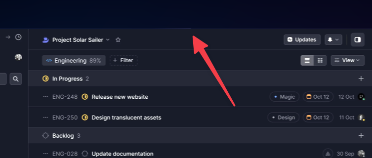
One example is these light pulses that streak along the outside edges of the Linear interface screenshot.
Another is this field of stars above a page divider.
And this strip-light style divider.
These techniques might be possible on a light mode website, but they don’t make stylistic sense. They don’t suit the “well lit” environment that a light mode website represents.
Unlike many websites that have tried to follow in their footsteps, Linear understands the styles that a dark mode website allows. And they take full advantage.
Unusual subtlety
The contrast of bright colours on a dark background is hard to resist. They look particularly good. But while their copy-cats may give in to temptation, Linear didn’t.
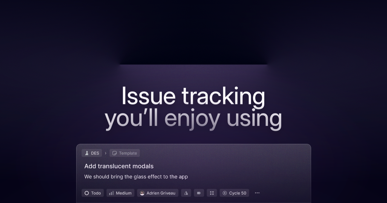
Linear’s lighting effects are unusually subtle. Take these four strip-light section headings.
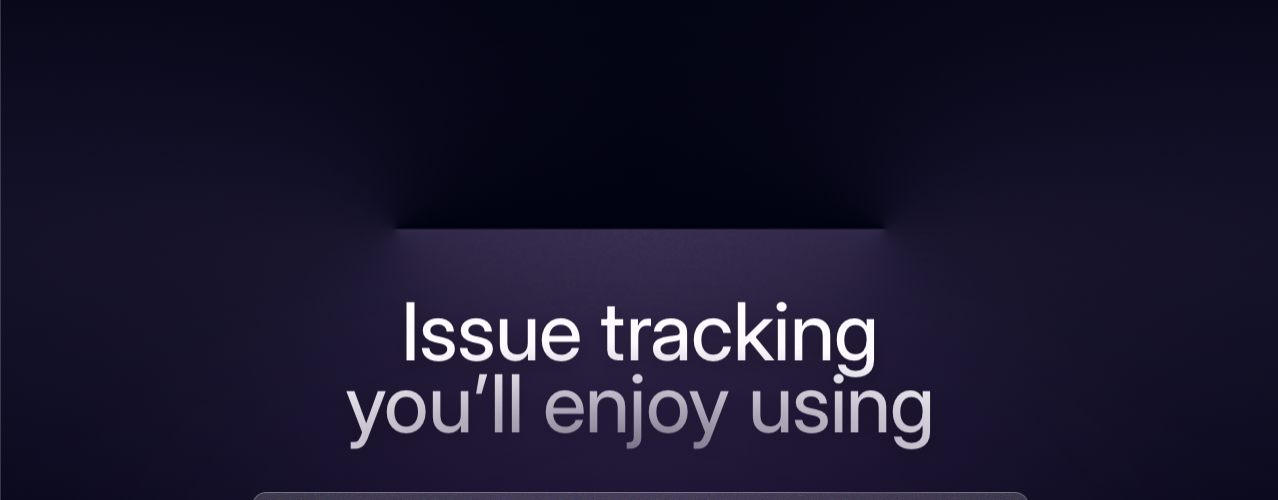
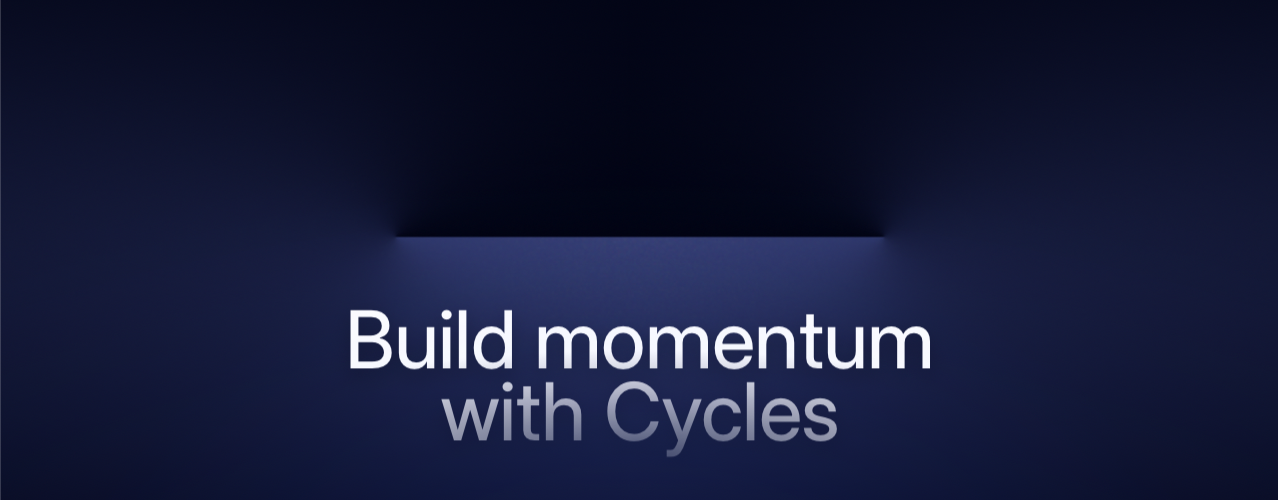

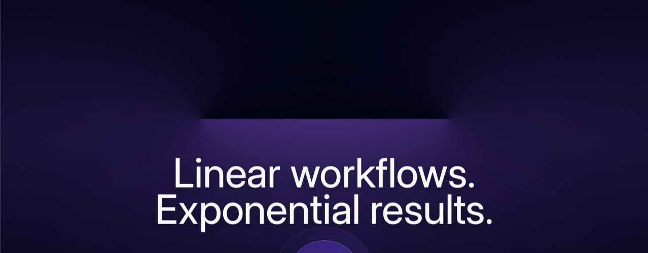
Lined up as they are here, it’s obvious that they’re different colours. But as you scroll through the website you see them alone. It took me a while to realise they were different when I first saw the website. This use of colour adds a rich visual theme to each section of the website. But it doesn’t draw attention to itself. The sign of an expert touch.
Conclusion
Linear deserves their crown as trend-setters. They approach website design with thoughtful innovation. I only hope that one day they design a light mode website, so we can see how it should be done.